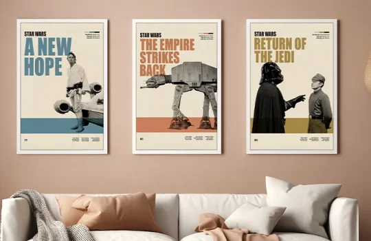
How to Style a Gallery Wall with Movie Prints
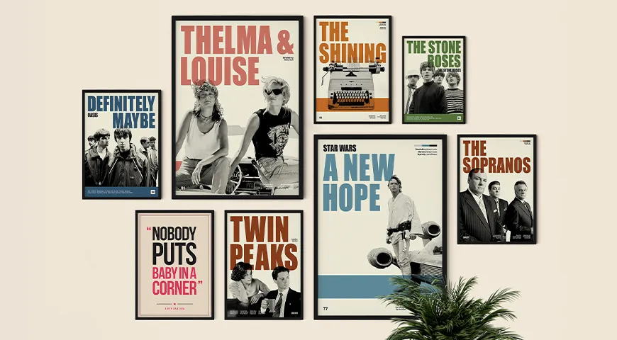
Retro film, TV and music prints have moved decisively into the interior design mainstream and styling them well is the key ingredient in making a gallery wall that looks considered and coherent.
Most people hang a single movie poster on a bare wall and wonder why it doesn’t look quite right. The print is fine. The film is great. But something about the execution, a lone rectangle floating on a big expanse of white wall, never quite works.
The difference between ‘poster on a wall’ and ‘gallery wall’ is intent. Choosing prints that work together, sizing them correctly, framing them consistently, and placing the arrangement deliberately. These decisions take a bit of thought upfront and make the difference between a wall that looks accidental and one that looks designed.
This guide walks through every decision ,from which prints belong together to where to hang them and how to avoid the most common mistakes. It is not complicated. It just needs to be done in the right order.
1: Choose a Unifying Thread - Don’t Just Pick Favourites
This is the most important step, and the one most people skip.
A Pulp Fiction print next to a Studio Ghibli print next to a Marvel poster looks like a teenager’s bedroom no matter how expensive the frames are. The eye needs a reason why these things belong together, a logic that makes the arrangement feel curated rather than collected. That logic is the unifying thread, and there are four reliable ways to find one.
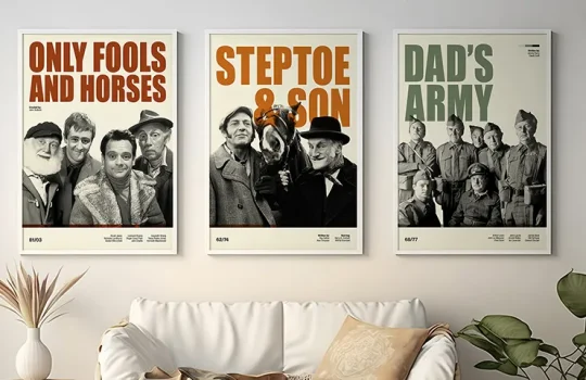
Genre or era. All cult horror. All British comedy. All 1970s American thrillers. A wall of five Hammer Horror prints is a statement; five random prints in the same genre is noise. The constraint is what makes it interesting.
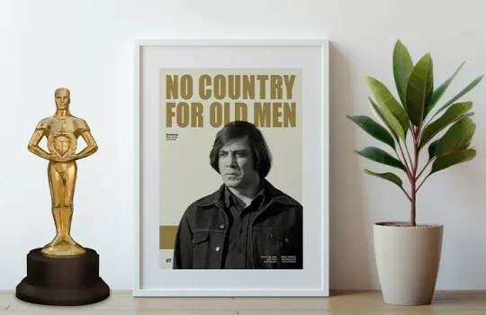
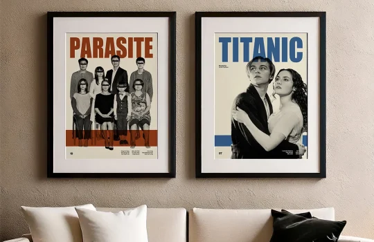
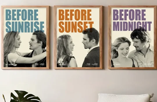
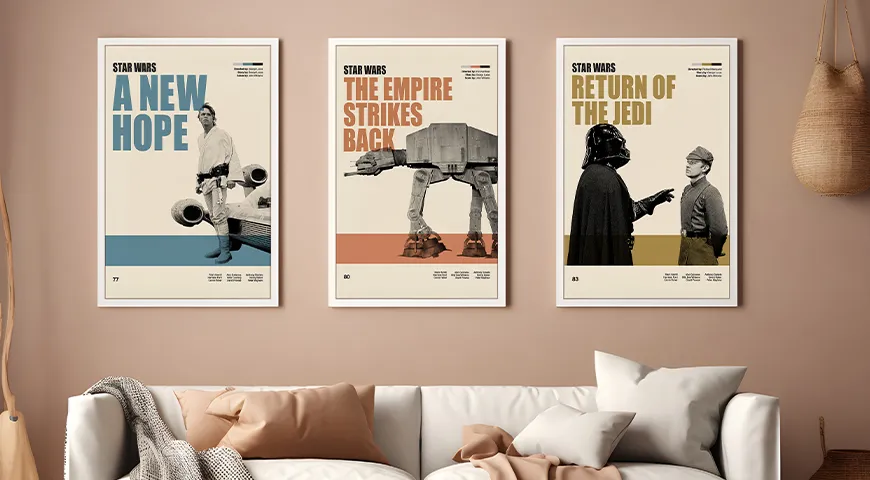
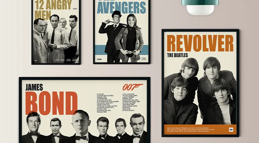
Aesthetic and design language. This is the subtler option, and the most powerful. Prints that share a visual style (bold typography, muted palettes, flat graphic illustration) create cohesion even across wildly different films. Because Reel Retro’s prints are all original retro designs with a consistent visual language, mixing films from different genres and eras is significantly easier than it is with standard licensed posters, the design style itself does the unifying work.
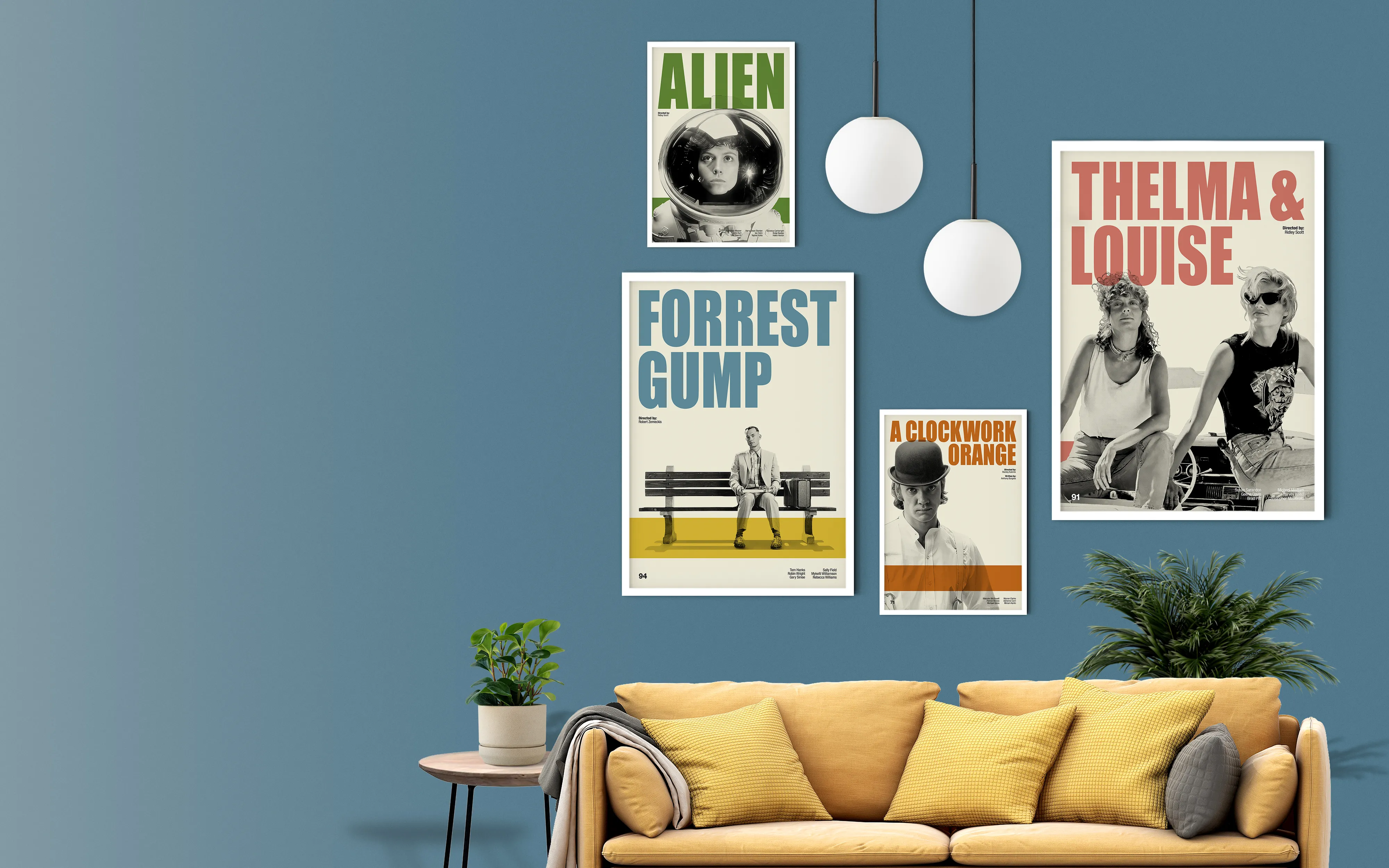
Colour palette. Prints that share dominant tones work together even when the subject matter differs. Warm ambers and burnt oranges, cool blues and deep greens, or a full monochrome collection: when the colours speak the same language, the eye reads the wall as a whole.
Director, actor, or creative voice. An all Hitchcock wall. An all Scorsese wall. A collection built around one actor’s career. For the serious film lover, this is the most personally meaningful option, it says something very specific about who you are and what you value.
Choose one thread before you buy a single print. Everything else follows from it.
2: Get the Size Combination Right
Gallery walls fail for two reasons: wrong thread (covered above) or wrong sizes. Size is where most of the visual work happens.
Start with an anchor piece. Every successful gallery wall has one dominant print the eye lands on first. For movie prints, a 50x70cm or 60x90cm portrait orientation print works as a strong anchor, tall enough to create a vertical spine that the rest of the arrangement balances around. Place it slightly off centre on the wall; a perfectly centred anchor feels corporate rather than curated. Everything else builds outward from it.
Three proven size combinations:
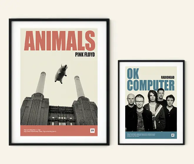
The starter — two prints. One 50x70cm and one 30x40cm, side by side or with the smaller print slightly lower. Clean, minimal, and works perfectly in narrow spaces, above a desk, or in a hallway. If you’re not sure a gallery wall is for you, start here.
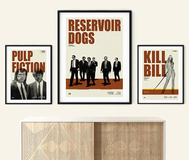
The classic trio — three prints. One 60x90cm anchor flanked by two 30x40cm prints, or arranged in an L-shape with one print stacked above the other. This is the most versatile arrangement, works above a sofa, in a hallway, or as a bedroom focal wall, and it’s the format that appears most often in well styled homes for good reason.
The full wall — five or more prints. One large anchor (60x90cm), two medium (50x70cm), and two or three small (30x40cm). Mix portrait and landscape orientations for rhythm and movement. Keep the frame spacing consistent throughout — 5cm between frames is the sweet spot for most layouts. Tighter spacing (2–3cm) creates a unified block; wider spacing (8–10cm) feels airy but risks looking disconnected. Pick one gap size and stick to it.
On orientation: most film prints are portrait, which suits gallery walls well. Mix in one or two landscape prints for rhythm. An all portrait arrangement can feel rigid; all landscape can feel squat. The mix is what creates visual interest.
Stick to three or four sizes maximum. More creates chaos. The eye can handle variation; it cannot handle randomness.
3: Choose Your Frames and Stick to One Finish
Here is the single most important framing rule: mix print sizes freely, mix genres freely, but keep all frames the same finish.
A set of prints in mismatched frames looks like they were collected accidentally rather than curated deliberately. One consistent finish across the entire wall signals that someone made conscious decisions, which is exactly what a gallery wall is supposed to communicate.
Black is the safest choice for film prints. It echoes cinema itself, works with virtually any interior, makes the artwork feel intentional and considered, and never dates. If in doubt, black frames.
Natural oak works well in warmer, Scandi influenced rooms or spaces with exposed wood furniture. It makes the prints feel less stark and more lived-in.
White frames suit bright, minimalist spaces where you want the prints to float rather than anchor. They work less well in darker rooms where the frames disappear into the wall.
On mounting: a white mount, the border between the print and the frame, adds breathing space and makes smaller prints feel more considered. Consistent mount widths across the whole arrangement look most intentional; 4–5cm mounts feel gallery-like, 2–3cm feel more modern.
Reel Retro prints are delivered flat and ready to frame. The standard sizes — 30x40cm, 40x50cm, 50x70cm, 60x90cm — correspond to widely available frames from IKEA, Desenio, and most independent framers, so custom framing is an option rather than a requirement.
4: Pick the Right Wall and Placement
The best gallery walls live on focal walls: the first wall you see when entering a room, the wall behind a sofa, or a hallway wall that people walk past repeatedly. Avoid walls broken up by doors or windows unless you’re designing deliberately around the interruptions.
Room by room:
Living room. The wall above the sofa is the classic location. Keep the bottom frame 15–20cm above the sofa back so the arrangement feels grounded rather than floating. A three to five print arrangement works well here.
Home cinema or media room. The most natural home for a film print gallery wall, and the room where rules are loosest. More prints, bolder choices, deeper colour. A wall of six to eight prints arranged around a mounted TV can anchor the entire room’s identity.
Hallway. Tall, narrow hallway walls suit portrait orientation prints stacked vertically or hung in a single column. Two or three of your most distinctive prints, well framed, is better than a crowded arrangement that people are too close to appreciate properly.
Bedroom. Keep it personal. The bedroom gallery wall is the most intimate arrangement in the home, prints that mean something specific rather than prints chosen for general visual effect. One large anchor above the bed or a small cluster on a side wall.
Hanging height. Hang the centre of the arrangement, or the centre of the anchor piece, at 145–152cm from the floor. That is gallery standard, and it works because it puts the visual midpoint at average adult eye level. Prints hung too high float away from the furniture below them; prints hung too low look like afterthoughts.
5: Plan the Layout Before you put a Single Nail in the Wall
This step takes twenty minutes and prevents an afternoon of filling unnecessary holes.
The paper template method. Cut pieces of paper to the exact size of each framed print (including the frame itself), tape them to the wall with low tack tape, and live with the arrangement for a day or two before committing. Move them freely. Swap the anchor from left to right. Try the cluster lower or higher. Take a photograph of the final arrangement before removing the paper templates, you will need it when measuring hook positions.
The floor plan method — For walls of five or more prints. Lay the frames out on the floor first in the rough arrangement you want, then photograph from above. It is significantly easier to assess visual balance, spacing, and weight distribution from a bird’s-eye view. Adjust on the floor until the arrangement reads correctly, then transfer to the wall using the template method.
One final rule: Start in the middle and work outward. Hang the anchor piece first, at the correct height, and build around it. Starting at the edges and working in is how arrangements end up lopsided.
Three Gallery Wall Combinations to Steal
These are three ready made combinations using Reel Retro prints, each with a defined thread, a proven size layout, and a clear sense of what they say about the room they’re in.
The British Comedy Wall. Fawlty Towers at 60x90cm as the anchor, Fleabag at 50x70cm to its left and slightly lower, a third British comedy print at 30x40cm completing the arrangement. Black frames, white mounts, hung above a sofa or sideboard. A wall that tells a specific story about who lives there, and that guests will spend ten minutes standing in front of.
The Cult Film Wall. The Lost Boys at 60x90cm as the anchor, flanked by two complementary cult prints at 40x50cm. All dark, saturated tones. Black frames, no mounts for a tighter, more graphic feel. Works in a media room, a games room, or a bedroom where the wall can carry more visual energy.
The Auteur Wall. The Life Aquatic at 60x90cm as the anchor, alongside Vertigo or another rich, design led film print at 50x70cm, with one small 30x40cm quote print completing the lower corner. Natural oak frames. For the film lover whose living room makes an argument.
In each case, the Reel Retro design language does the unifying work, the consistent retro aesthetic across different films means the combination reads as a collection rather than a coincidence.
The mistake most people make is thinking about a gallery wall as a display of things they like. It works better when you think of it as an edit, a set of decisions about what belongs together, at what scale, in what arrangement, in which room.
Those decisions say something. The film lover with a wall of five perfectly framed British comedy prints in matching black frames above their sofa has communicated something precise and personal about who they are. That is what good interior design does, and it is what a well executed gallery wall of film prints can do better than almost any other kind of wall art.
Start with the thread. Everything else follows.
Browse our full collection of original retro film and TV prints at reelretroprints.com — available in various sizes, free tracked worldwide delivery, ready to frame.